FormEngine Designer for developers - Packages and architecture
FormEngine Designer for developers - Packages and architecture
:::info For form authors
If you design forms in the UI without writing code, use the Form Author Guide instead of this page.
:::
This page describes npm packages, dependencies, and a step-by-step demo tutorial with custom action code. For installation and React embedding, continue to Installation and Usage.
NPM packages
Form Builder consists of the following NPM packages:
- @react-form-builder/core.
- @react-form-builder/designer.
- @react-form-builder/components-rsuite.
- @react-form-builder/components-fast-qr.
- @react-form-builder/components-rich-text.
- @react-form-builder/components-print.
Form Builder packages rely on peer dependencies. Make sure your package manager automatically installs peer dependencies.
@react-form-builder/core package
This is the main Form Builder package that contains the React methods and components for displaying the form. This package must be used at runtime.
@react-form-builder/designer package
This is a package containing a visual form designer. This package is only needed for designing forms; it is not needed for displaying forms.
@react-form-builder/components-rsuite package
This package contains components and metadata from the React Suite library. You may use another component library instead.
@react-form-builder/components-fast-qr
QR code component based on Fast QR.
@react-form-builder/components-rich-text
Rich text editor component based on Quill.
@react-form-builder/components-print
Page breaks and print header/footer for browser printing. See Page break and Print settings.
GitHub example
Clone the FormEngine GitHub repository and follow the README. The example combines core, designer, and RSuite components.
Detailed demo tutorial (RSuite)
The walkthrough below uses the public demo at https://demo.formengine.io/ with RSuite-oriented labels. For a Material UI–oriented author path without code, use the Form Author Guide.
Workspace layout
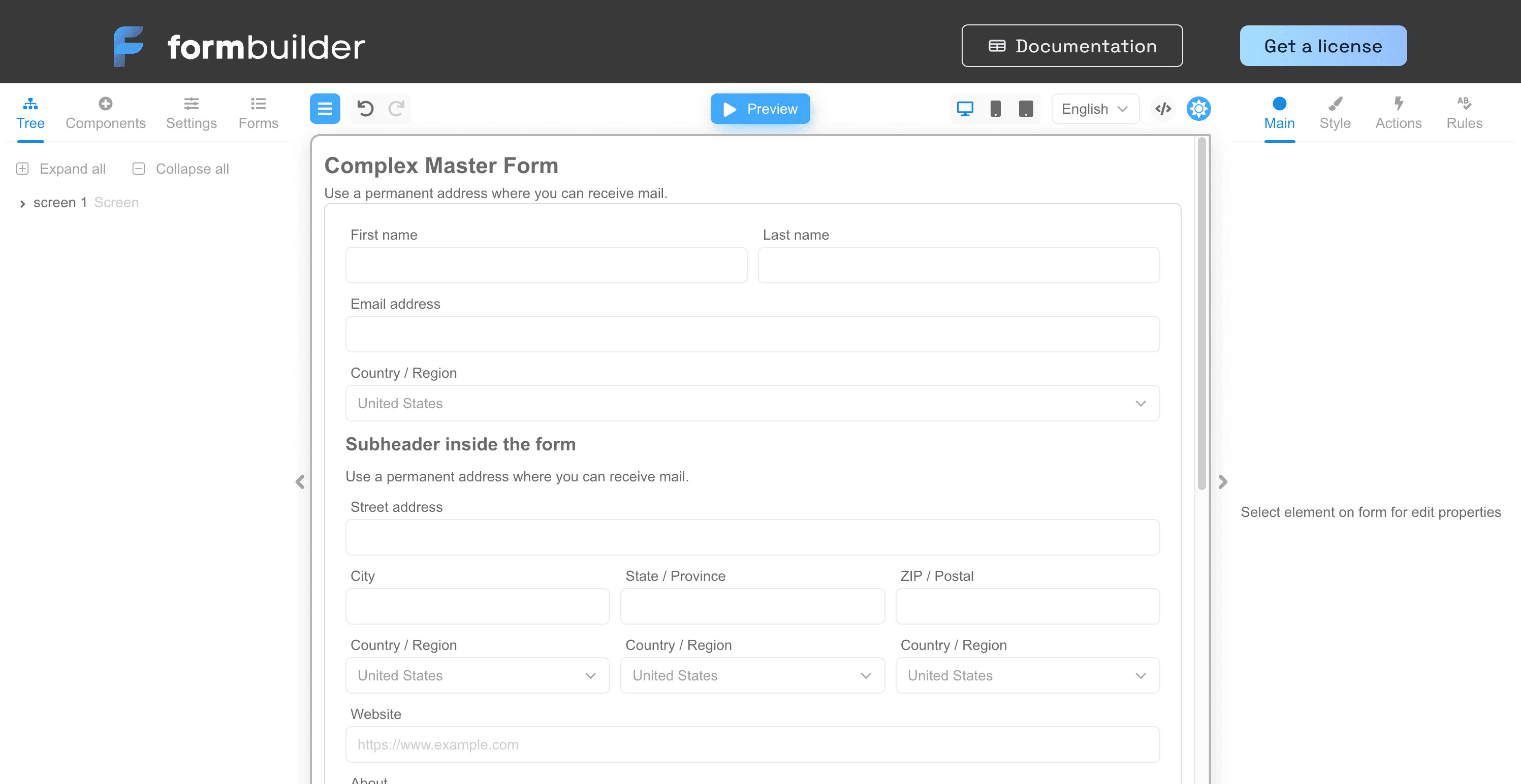
The screen is divided into three parts:
- Left - Tree, Components, Settings, Forms
- Center - menu, undo/redo, Preview/Edit, device modes, language, JSON view, theme
- Right - Main, Style, Actions, Rules
Create a form (demo)
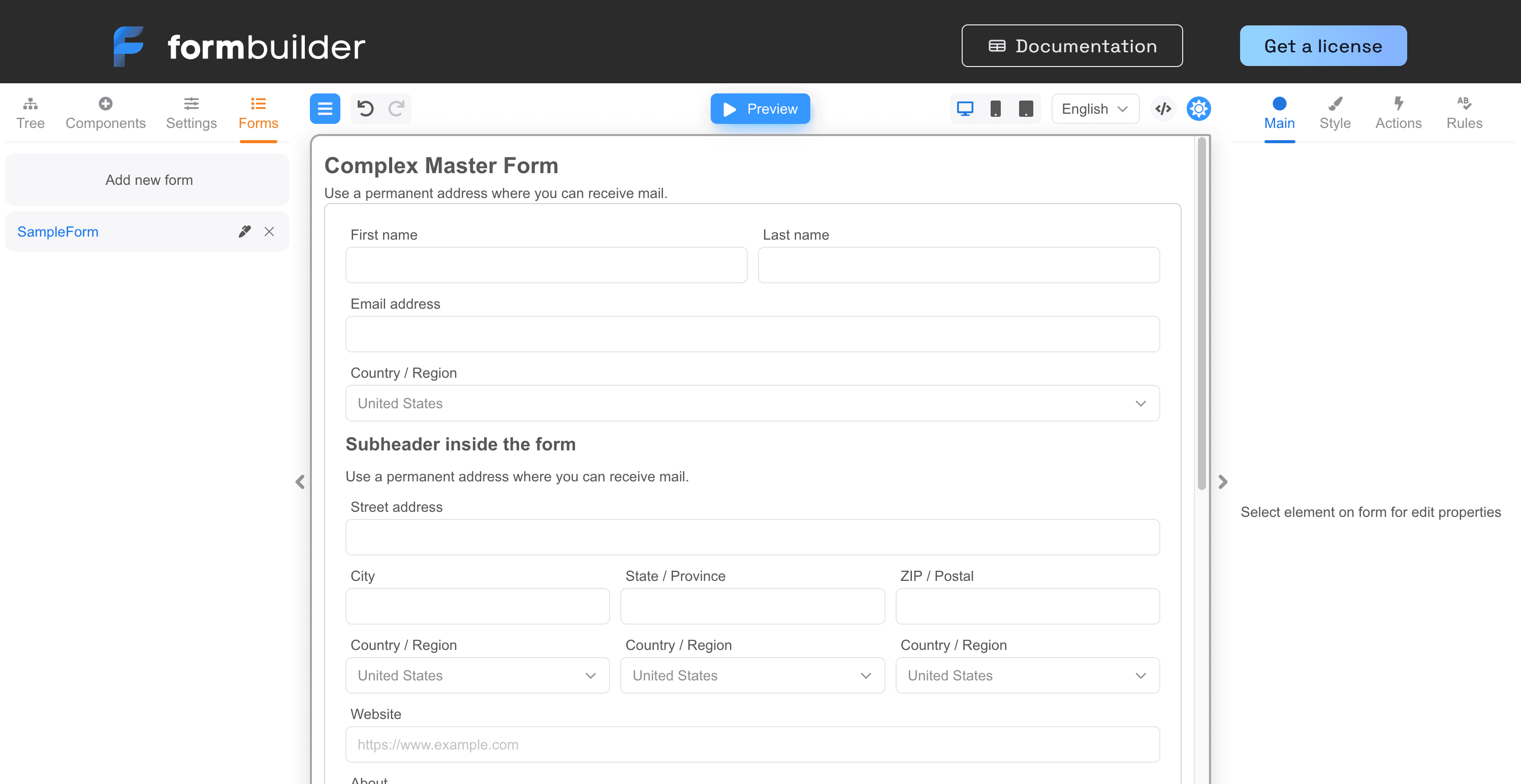
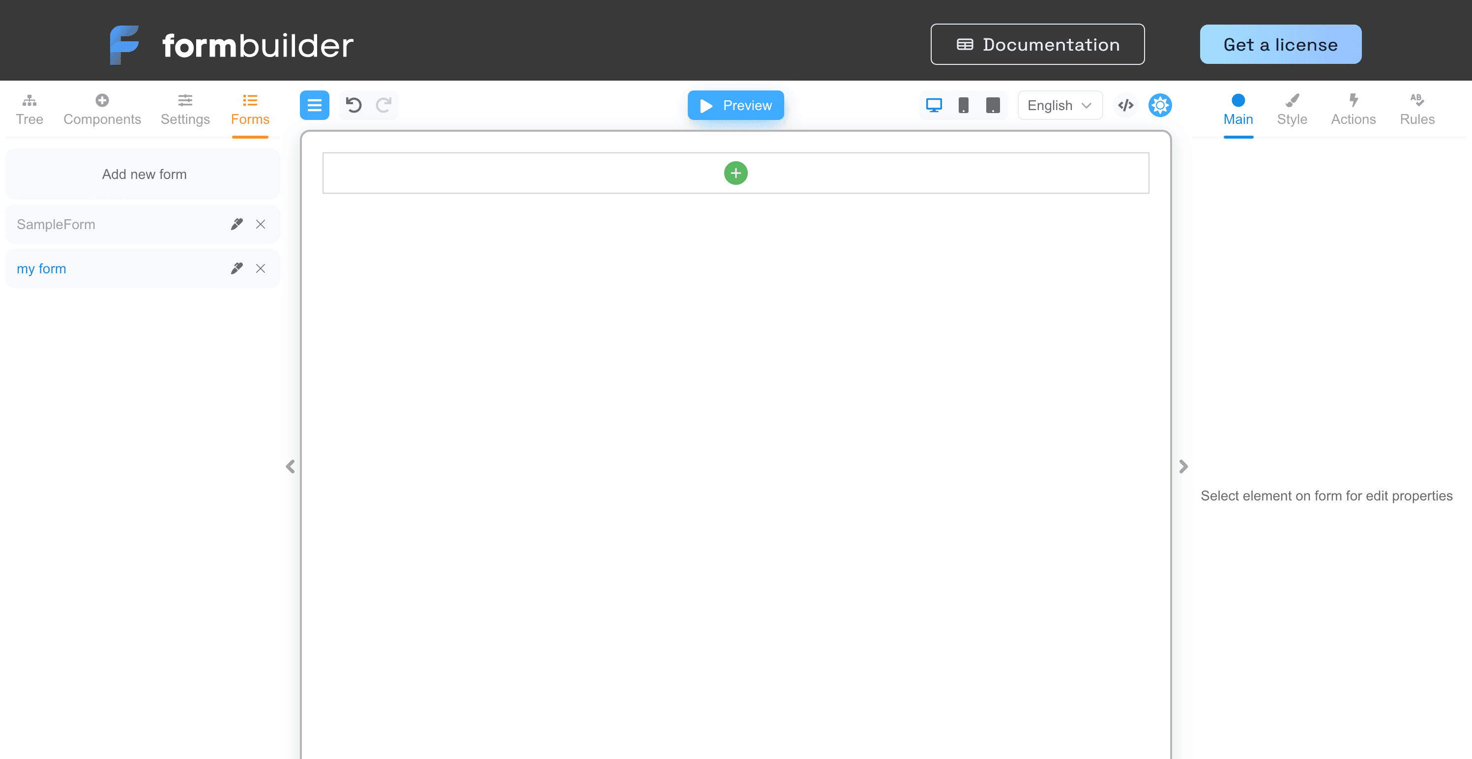
Add Input and Button components, set Key name and label Name, set button Content to Submit (getting-started-06–09).
Validation and actions (code)
Add Required and Min rules on the input (getting-started-10–11). Add a custom onClick action on the button (getting-started-12–14):
/**
 * @param {ActionEventArgs} e - the action arguments.
 * @param {} args - the action parameters arguments.
 */
async function Action(e, args) {
  console.log('Name', e.data.name)
}
- ActionEventArgs
econtains event data. - Record<string, unknown>
e.datais the form data object.
Read and write fields with e.data.name. Example mutation:
async function Action(e, args) {
  console.log('Name', e.data.name)
  e.data.name = `Marta ${new Date().getTime()}`
}
Preview and validate action order
Use Preview, then add validate before the custom action (getting-started-15–17). Adjust Error type and Tooltip type on Settings (getting-started-18–21).
Authors: see Action order on buttons and Form-wide errors and tooltips.
Summary
- core renders forms; designer is the visual editor; component packages supply widgets.
- Authors should use the Form Author Guide; integrators use installation, usage, and this page.