Designer customization
Customizing the FormBuilder interface
Using the customization FormBuilder prop, you can
hide, style, or replace any parts of the FormBuilder interface.
A customization map object is passed to this property, in which
the options of the desired component are set using
its customizable key.
You can manage the FormBuilder and get its state in custom components using useFormBuilder. It provides access to IFormBuilder. The management options are limited at the moment, but they will be expanded in the future.
Another option for customizing the component is to use pure CSS. Each component has a static CSS class named with the component's name
prefixed by FE_. This class is applied to the same element as the style or className attributes, utilizing
the customization map.
The components palette in the left panel also has some additional rules for CSS customization.
A list of customizable components is also available as a Set.
Example
import {type CustomizationMap, FormBuilder, useFormBuilder} from '@react-form-builder/designer'
import {useCallback} from 'react'
const CustomToggleModeButton = () => {
const builder = useFormBuilder()
const label = builder.builderMode === 'builder' ? 'PreviewMode' : 'EditMode'
const toggleMode = useCallback(() => {
builder.builderMode = builder.builderMode === 'builder' ? 'viewer' : 'builder'
}, [builder])
return <button onClick={toggleMode}>{label}</button>
}
const simpleCustomization: CustomizationMap = {
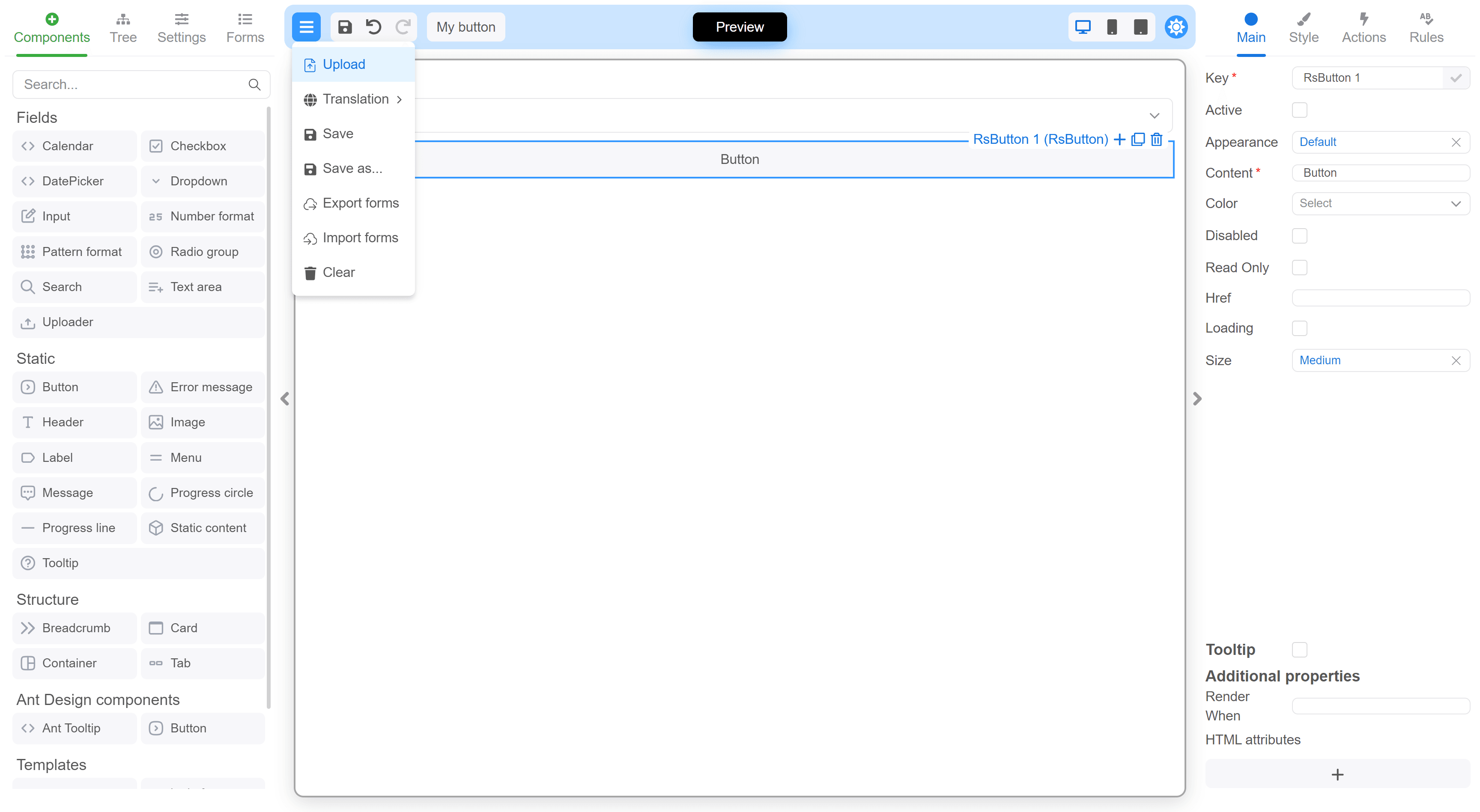
// Hiding the "Download" item in the main menu by using nested CSS selectors.
MainMenu_Dropdown: {
style: `
#menuitem-\\:r5\\: {
display: none;
}
`
},
// Customizing Header styles
Header: {
className: 'MyClassName',
style: {
backgroundColor: 'rgba(52,152,255,.25)',
borderRadius: '10px',
margin: 5,
marginBottom: 10,
padding: '8px!important'
}
},
// Adding a custom button to the header toolbar.
Header_Toolbar: {
customRenderer: defaultElement => <div style={{display: 'flex', gap: 10}}>
{defaultElement}
<button className={'rs-btn rs-btn-sm'}>My button</button>
</div>
},
// Component toolbar (the toolbar on each selected component in the canvas): add a custom button and hide the default remove (trash) button.
Component_Toolbar: {
customRenderer: defaultElement => (
<div>
{defaultElement}
<span style={{marginLeft: 4, padding: '2px 6px', fontSize: 24}}>
Custom
</span>
</div>
)
},
// Changing the "Toggle mode" button to a custom component.
ToggleModeButton: {
customRenderer: () => <CustomToggleModeButton/>
},
// Hiding the localization dropdown.
LocalizationSelect: {
hidden: true
},
// Hiding the "Json view" button
JsonViewButton: {
hidden: true
},
// Hiding the property code button
PropertyCodeButton: {
hidden: true
}
}
const FormBuilderApp = () => {
return <FormBuilder
customization={simpleCustomization}
// other props
/>
}
Complete list of customizable component keys
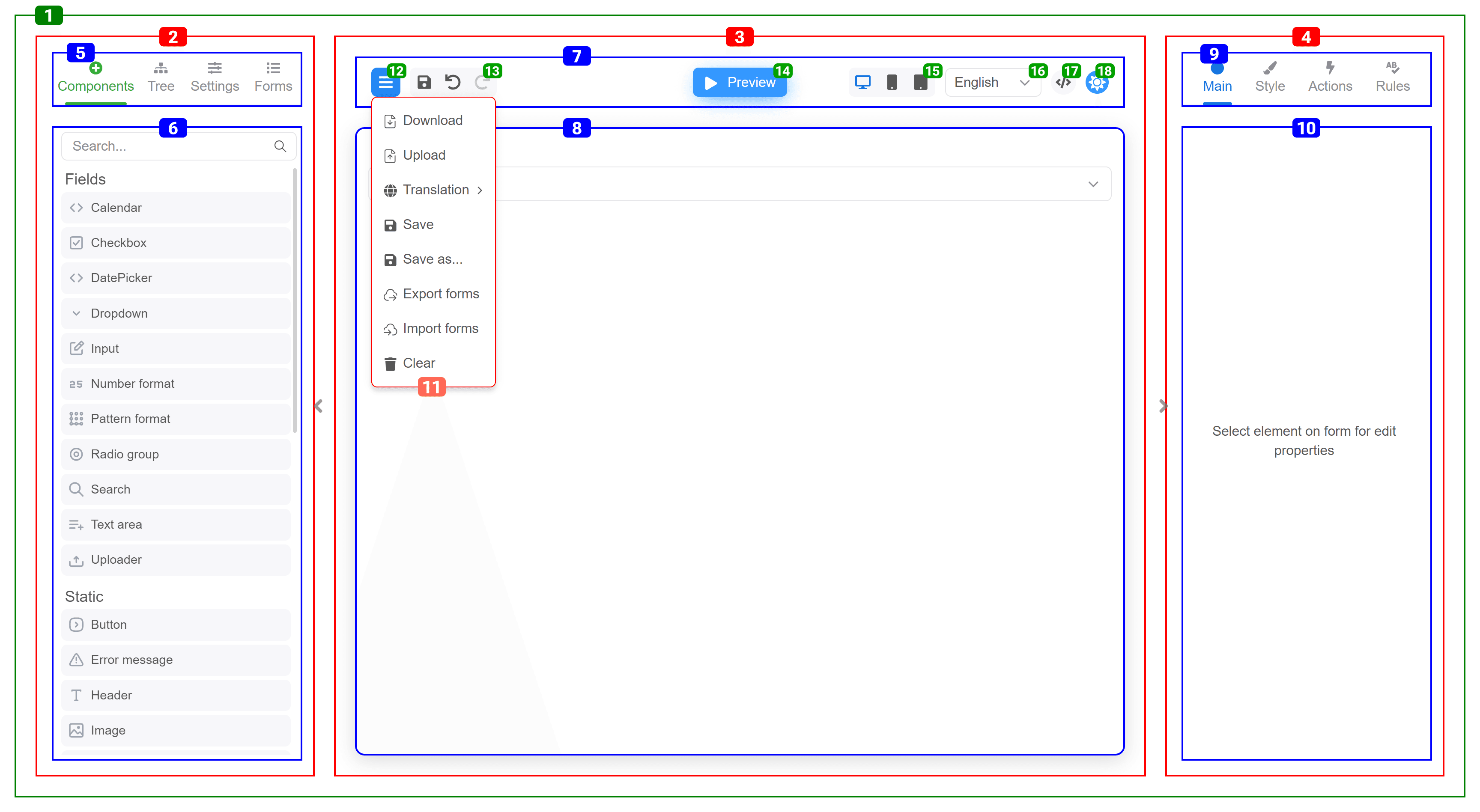
| # | Name | className |
|---|---|---|
| 1 | MainContainer | FE_MainContainer |
| 2 | LeftPanel | FE_LeftPanel |
| 3 | CentralPanel | FE_CentralPanel |
| 4 | RightPanel | FE_RightPanel |
| 5 | LeftPanel_Nav | FE_LeftPanel_Nav |
| 6 | LeftPanel_Content | FE_LeftPanel_Content |
| 7 | Header | FE_Header |
| 8 | FormContainer | FE_FormContainer |
| 9 | RightPanel_Nav | FE_RightPanel_Nav |
| 10 | RightPanel_Content | FE_RightPanel_Content |
| 11 | MainMenu_Dropdown | FE_MainMenu_Dropdown |
| 12 | MainMenu_Button | FE_MainMenu_Button |
| 13 | Header_Toolbar | FE_Header_Toolbar |
| 14 | Component_Toolbar | FE_Component_Toolbar |
| 15 | Component_Toolbar_Items | FE_Component_Toolbar_Items |
| 16 | Component_Toolbar_Title | FE_Component_Toolbar_Title |
| 17 | Component_Toolbar_AddButton | FE_Component_Toolbar_AddButton |
| 18 | Component_Toolbar_CloneButton | FE_Component_Toolbar_CloneButton |
| 19 | Component_Toolbar_PresetComponentButton | FE_Component_Toolbar_PresetComponentButton |
| 20 | Component_Toolbar_RemoveButton | FE_Component_Toolbar_RemoveButton |
| 21 | ToggleModeButton | FE_ToggleModeButton |
| 22 | ResolutionSelect | FE_ResolutionSelect |
| 23 | LocalizationSelect | FE_LocalizationSelect |
| 24 | JsonViewButton | FE_JsonViewButton |
| 25 | ToggleThemeButton | FE_ToggleThemeButton |
| # | Name | className | aux classes |
|---|---|---|---|
| 1 | Components_Tab | FE_Components_Tab | |
| 2 | Components_Tab_Content | FE_Components_Tab_Content | |
| 3 | Tree_Tab | FE_Tree_Tab | |
| 4 | Tree_Tab_Content | FE_Tree_Tab_Content | |
| 5 | Settings_Tab | FE_Settings_Tab | |
| 6 | Settings_Tab_Content | FE_Settings_Tab_Content | |
| 7 | Forms_Tab | FE_Forms_Tab | |
| 8 | Forms_Tab_Content | FE_Forms_Tab_Content | |
| 9 | Main_Tab | FE_Main_Tab | |
| 10 | Style_Tab | FE_Style_Tab | |
| 11 | Actions_Tab | FE_Actions_Tab | |
| 12 | Rules_Tab | FE_Rules_Tab | |
| 13 | Main_Tab_Content, Style_Tab_Content, Actions_Tab_Content, Rules_Tab_Content | FE_Main_Tab_Content, FE_Style_Tab_Content, FE_Actions_Tab_Content, FE_Rules_Tab_Content | |
| 14 | LabeledProperty | FE_LabeledProperty | valueModified |
| 15 | PropertyCodeButton | FE_PropertyCodeButton | |
| 16 | PropertyLabel | FE_PropertyLabel | |
| 17 | PropertyInput | FE_PropertyInput |
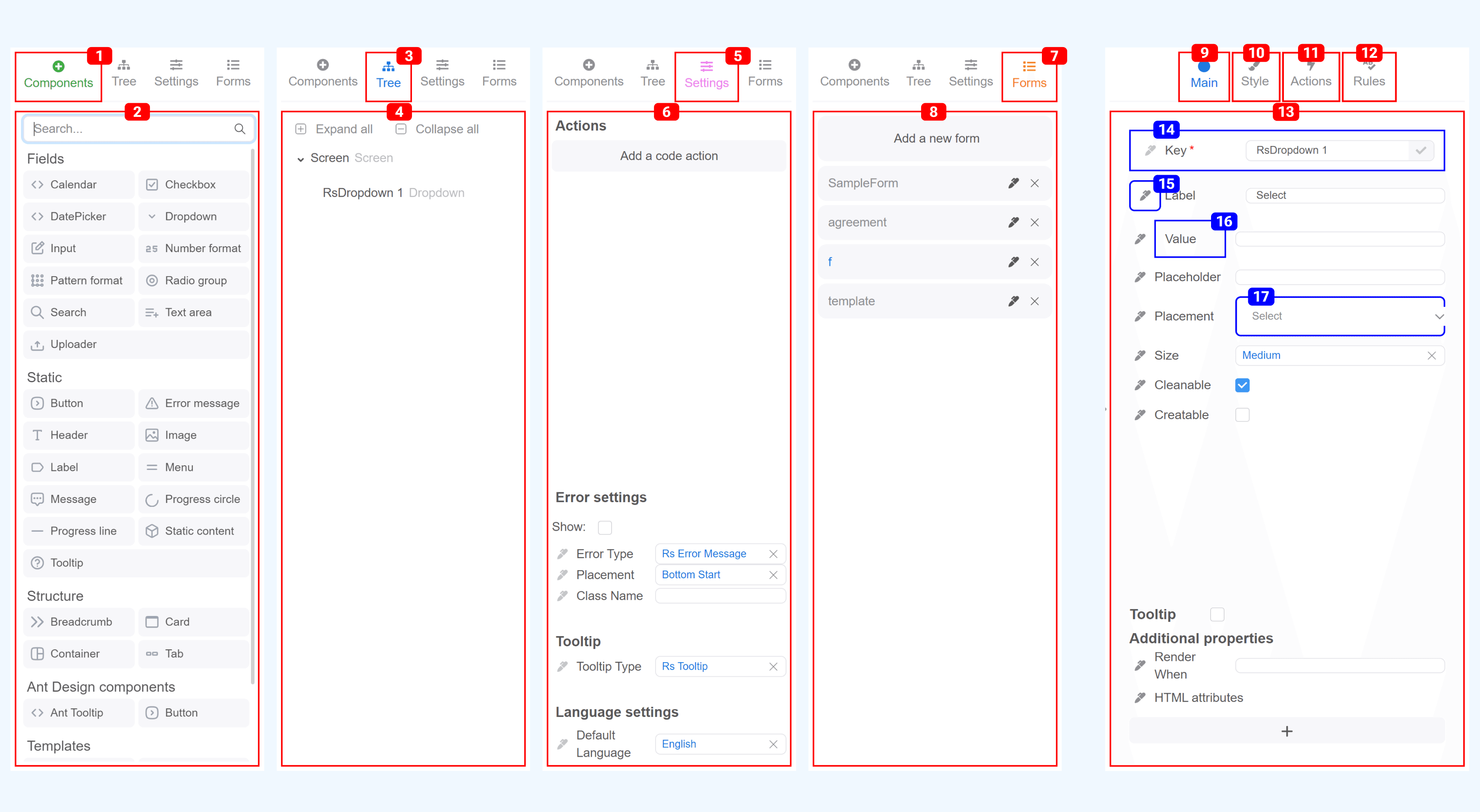
Components palette
Each group and component receives a set of classes composed of its name and type.
When defining a component, you can specify its category. Components with the same category are merged into component groups on the palette.
export const richTextEditor = define(RichTextEditor, 'RichTextEditor')
  .name('Rich text editor')
  .category('fields')
  .props({
    //...
  })
Components group
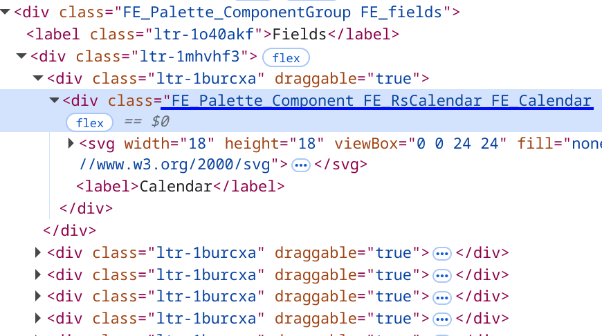
A component group is assigned the static class FE_Palette_ComponentGroup along with a category name prefixed with FE_.
If a component group is not defined, components appear at the top of the list without a title and within container with additional class
FE_top.
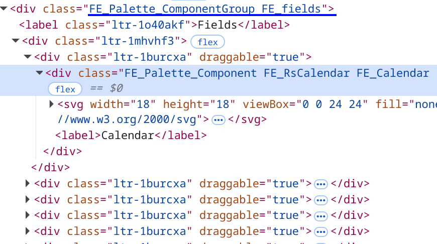
Single component
A component receives the static class FE_Palette_Component composed with its title and name, both prefixed with FE_.
export const rsCalendar = define(RsCalendar, 'RsCalendar')
  .name('Calendar')
  .props({
    // ...
  })
Custom property editors
Using the propertyEditors FormBuilder prop, you can override existing component property editors or set editor for your custom property.
Example
import type {AnnotationEditorProps} from '@react-form-builder/designer'
import {FormBuilder} from '@react-form-builder/designer'
import {RgbaColorPicker} from 'react-colorful'

const MyKeyInput = (props: AnnotationEditorProps) => {
  const {value, onChange} = props
  return <input value={value} onChange={(event) => onChange(event.target.value)}/>
}

/**
 * Converts the string containing a rgba color value into an object.
 * @param value the string containing a rgba color.
 * @returns the object with properties '{r, g, b, a}'.
 */
export function rgbFromString(value: string): RgbaColor {
  const matchColors = /^rgba?\((\d+),\s*(\d+),\s*(\d+)(?:,\s*(\d+(?:\.\d+)?))?\)$/
  const [, r, g, b, a] = matchColors.exec(value) || []
  return {r: Number(r), g: Number(g), b: Number(b), a: Number(a)}
}

const MyColorInput = (props: AnnotationEditorProps) => {
  const {value, onChange, onClean, showError, annotation} = props

  const onColorChange = useCallback((newColor?: RgbaColor) => {
    if (newColor) {
      const {r, g, b, a} = newColor
      onChange(`rgba(${r}, ${g}, ${b}, ${a})`)
      return
    }
    onChange(newColor)
  }, [onChange])

  const color = rgbFromString(value ?? 'rgba(255, 255, 255, 0)')

  return <div>
    <label>{annotation.name}</label>
    <RgbaColorPicker color={color} onChange={onColorChange}/>
    <label>{showError?.()}</label>
    <button onClick={onClean}>Clean</button>
  </div>
}

const FormBuilderApp = () => {
  return <FormBuilder
    propertyEditors={{
      // Overriding the default key property editor
      key: MyKeyInput,

      // Setting the property editor for your own custom property
      customColor: MyColorInput
    }}
    // other props
  />
}