Adaptive layout
:::info For form authors
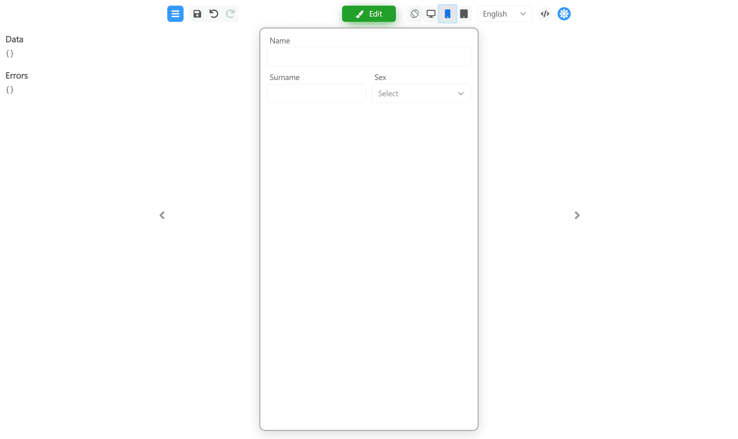
Preview Desktop, Mobile, and Tablet in the header before you publish.
Full guide → :::
Adaptive layout
Form Builder allows you to set different styles for different layouts. In the "For device" drop-down menu on the "Style" tab, you can select the device for which the styles will be applied. The device is determined by the width of the window:
- Any - these styles are applied to all devices, regardless of window width.
- Desktop - for desktop devices with a window width greater than 900 pixels.
- Mobile - for mobile devices where the window width is less than or equal to 600 pixels.
- Tablet - for tablet devices where the window width is less than or equal to 900 pixels.
- Custom breakpoints - this functionality is in development. Will be added later.
Let's take a look at how this works. To demonstrate, let's create a form with three fields located in one container.
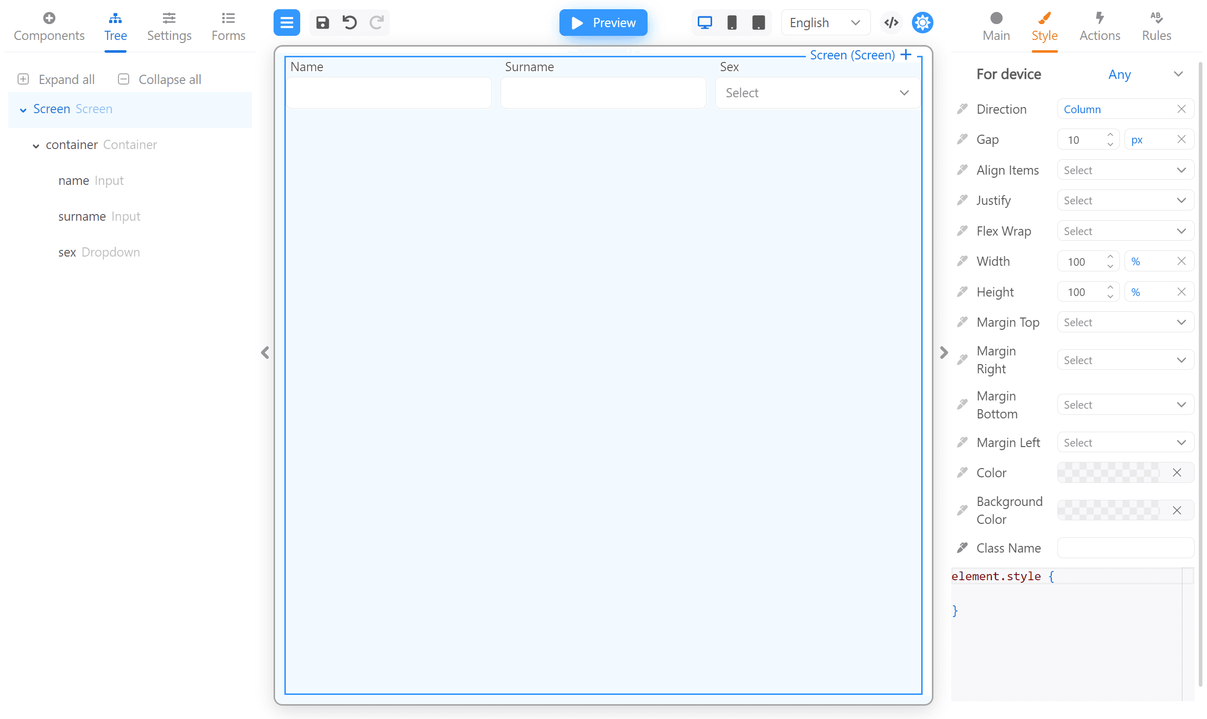
This is a ready-made JSON form with this example. You can copy it to the JSON form editor for see how it works. Click the </> button, then paste the code below and close the "Edit JSON" window.
Form JSON
{
  "version": "1",
  "form": {
    "key": "Screen",
    "type": "Screen",
    "props": {},
    "css": {
      "any": {
        "string": ""
      },
      "desktop": {
        "string": "    padding: 20px;\n    border: 1px solid lightgrey;\n    border-radius: 6px;"
      }
    },
    "children": [
      {
        "key": "container",
        "type": "RsContainer",
        "props": {},
        "css": {
          "any": {
            "object": {
              "flexDirection": "row"
            }
          },
          "mobile": {
            "object": {
              "flexDirection": "row",
              "flexWrap": "wrap"
            }
          }
        },
        "children": [
          {
            "key": "name",
            "type": "RsInput",
            "props": {
              "label": {
                "value": "Name"
              }
            },
            "wrapperCss": {
              "mobile": {
                "object": {
                  "width": "100%"
                }
              },
              "any": {
                "object": {
                  "width": "100%"
                }
              }
            }
          },
          {
            "key": "surname",
            "type": "RsInput",
            "props": {
              "label": {
                "value": "Surname"
              }
            },
            "wrapperCss": {
              "mobile": {
                "object": {
                  "width": "auto"
                },
                "string": "    flex: 1;"
              },
              "any": {
                "object": {
                  "width": "100%"
                }
              }
            },
            "css": {
              "mobile": {
                "string": "    "
              }
            }
          },
          {
            "key": "sex",
            "type": "RsDropdown",
            "props": {
              "label": {
                "value": "Sex"
              }
            },
            "wrapperCss": {
              "mobile": {
                "object": {
                  "width": "auto"
                },
                "string": "    flex: 1;"
              }
            }
          }
        ]
      }
    ]
  },
  "localization": {},
  "languages": [
    {
      "code": "en",
      "dialect": "US",
      "name": "English",
      "description": "American English",
      "bidi": "ltr"
    }
  ],
  "defaultLanguage": "en-US"
}
We have added the following styles for the Screen in Desktop mode:
element.style {
  padding: 20px;
  border: 1px solid lightgrey;
  border-radius: 6px;
}
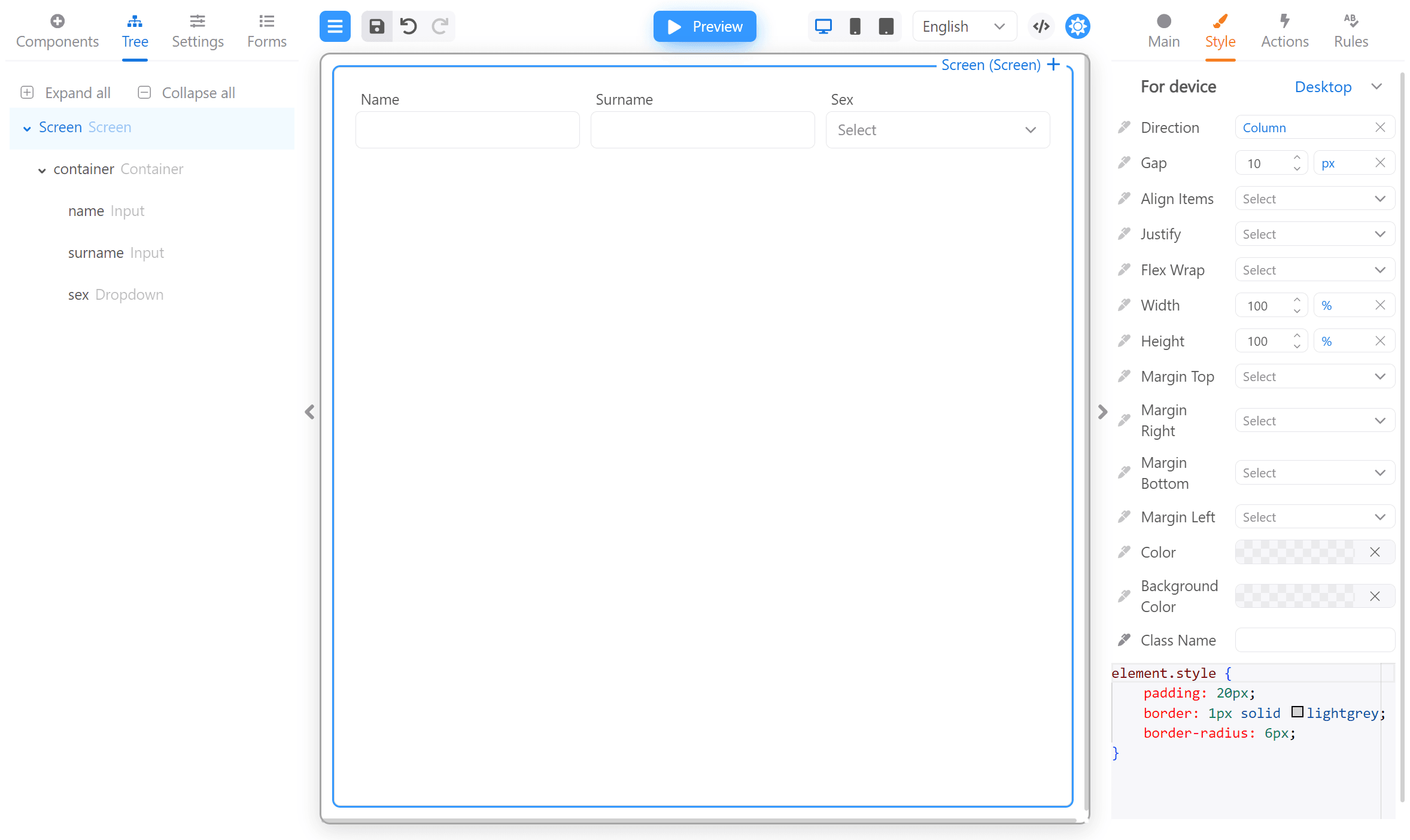
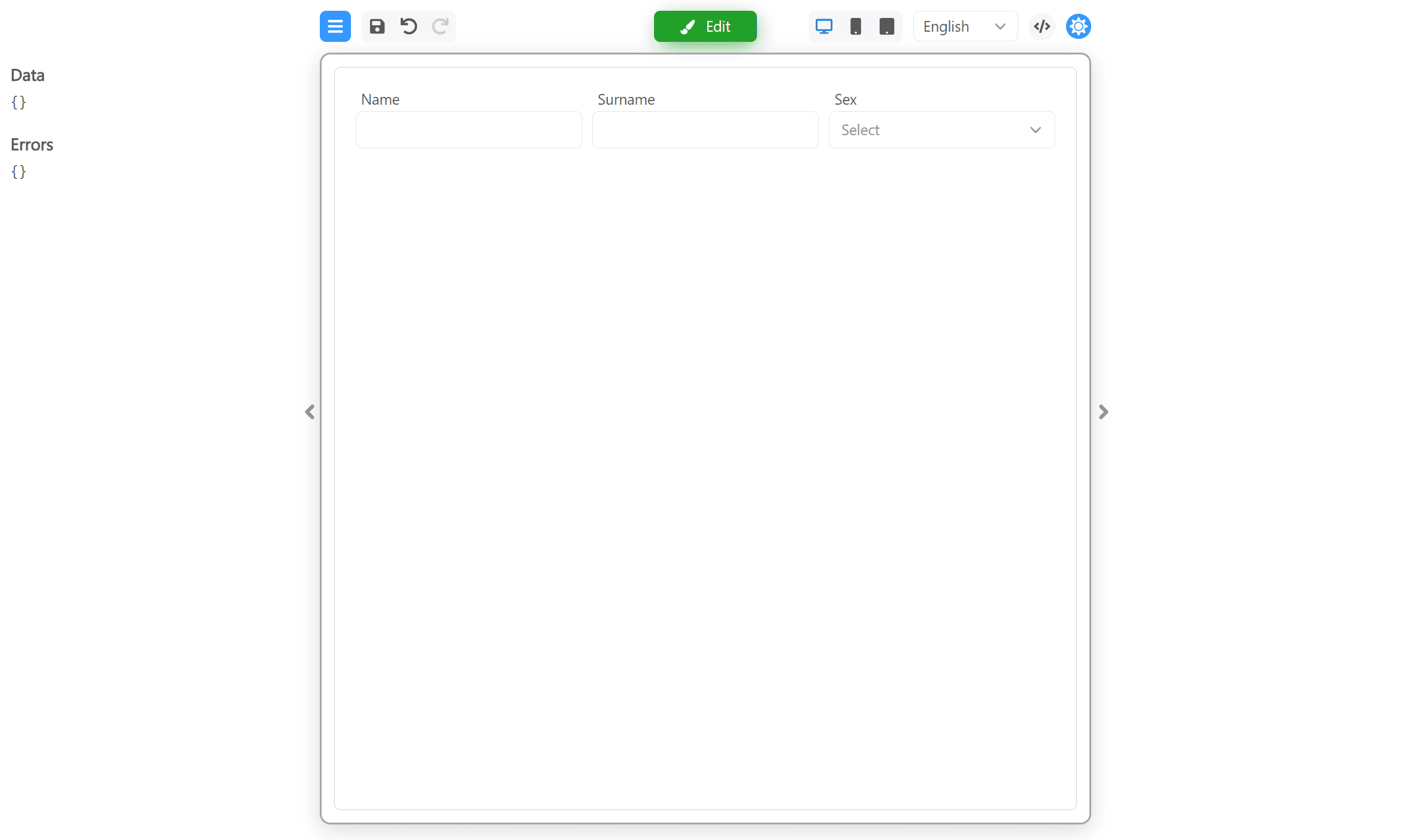
This is how it looks in Preview mode:
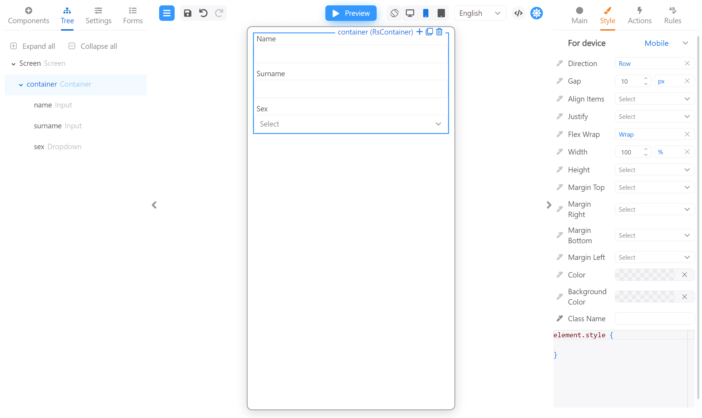
We have also set the Direction: row and Flex wrap: wrap for the container in Mobile mode:
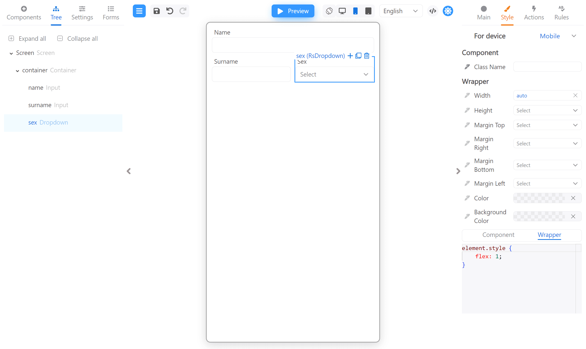
And set Width: auto and flex: 1 for Surname and Sex inputs Wrapper:
Now we can look at the result by switching between devices in display modes: