Signature
Introduction
The Signature component is a drawing pad where users sign with a mouse, touchpad, or touch screen. Typical uses include consent forms and contracts.
It lives in a separate package, @react-form-builder/components-signature, under a commercial license. For commercial use, contact sales@optimajet.com.
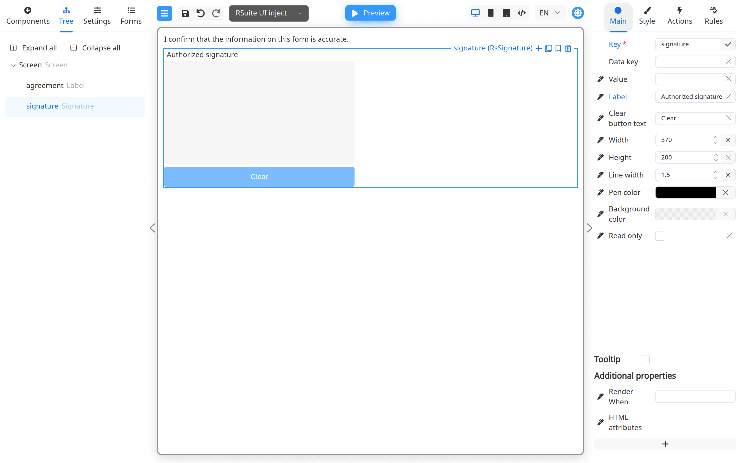
The pad value is a PNG data URL string. On the Main tab you can set the label, canvas size, pen color and thickness, background color, and Clear button text.
Installation
npm install @react-form-builder/components-signature
You also need @react-form-builder/core and, for the designer, @react-form-builder/designer. The examples below assume you already use
@react-form-builder/components-rsuite and add Signature next to those components.
Connection to FormBuilder
Register signatureComponent in a BuilderView so Signature appears in the palette:
import {rSuiteComponents} from '@react-form-builder/components-rsuite'
import {BuilderView, FormBuilder} from '@react-form-builder/designer'
import {signatureComponent} from '@react-form-builder/components-signature'

const components = rSuiteComponents.map(c => c.build())
const builderView = new BuilderView([...components, signatureComponent.build()])

function App() {
  return <FormBuilder view={builderView} />
}
You can pass signatureComponentsDescriptions (or a localized map) with .withComponentLibraryDescription(...) so Designer property labels
match your UI language. See the API reference.
Connection to FormViewer
Register signatureModel on a View (or use signatureComponent.build().model):
import {signatureModel} from '@react-form-builder/components-signature'
import {rSuiteComponents} from '@react-form-builder/components-rsuite'
import {FormViewer, View} from '@react-form-builder/core'

const components = [
  ...rSuiteComponents.map(c => c.build().model),
  signatureModel,
]
const view = new View(components)

const form = `{
  "form": {
    "key": "Screen",
    "type": "Screen",
    "props": {},
    "children": [
      {
        "key": "signature",
        "type": "RsSignature",
        "props": {
          "label": { "value": "Sign here" },
          "width": { "value": 370 },
          "height": { "value": 200 }
        }
      }
    ]
  }
}`

function App() {
  return <FormViewer view={view} getForm={() => form} />
}
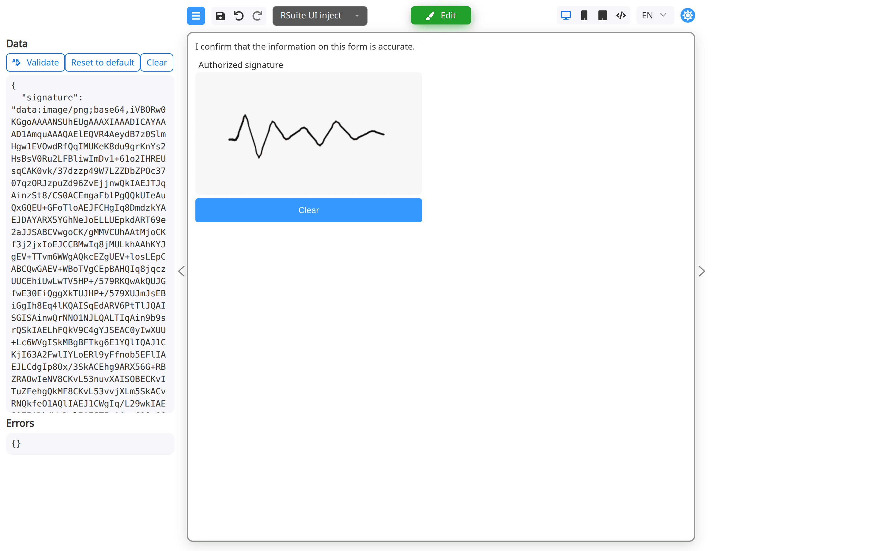
In form JSON the type is RsSignature. The valued property is value (data URL). An onChange handler receives the new data URL after
each stroke or when the user clears the pad.
Sample form JSON
Example with common Main-tab settings:
{
  "form": {
    "key": "Screen",
    "type": "Screen",
    "props": {},
    "children": [
      {
        "key": "signature",
        "type": "RsSignature",
        "props": {
          "label": { "value": "Authorized signature" },
          "clearButtonText": { "value": "Clear" },
          "width": { "value": 370 },
          "height": { "value": 200 },
          "lineWidth": { "value": 1.5 },
          "penColor": { "value": "rgba(0, 0, 0, 1)" },
          "backgroundColor": { "value": "rgba(167, 167, 167, 0.1)" },
          "readOnly": { "value": false }
        }
      }
    ]
  }
}
Main properties
The following general properties are available within the Main tab:
| Name | Type | Description |
|---|---|---|
| Value | string | Initial data URL for the signature image |
| Label | string | Text displayed above the pad |
| Clear Button Text | string | Label for the Clear button |
| Width | number | Canvas width in pixels |
| Height | number | Canvas height in pixels |
| Line Width | number | Pen stroke thickness |
| Pen color | color | Pen stroke color |
| Background color | color | Canvas background color |
| Read Only | boolean | When true, disables drawing and hides the Clear button |
At the bottom of the Main properties menu, you can find additional options:
- Render When: Provides conditional rendering for your component as described in the corresponding chapter.
- HTML attributes: Allows you to provide custom HTML attributes for your form.
Style properties
These are properties that allow to customize the size, color and other style properties of your component:
- For Device: You can provide component's style customization for all devices or specific devices by using this dropdown list. Refer to Adaptive Layout for more details.
- Component > Class Name: Add a class name for your component for the subsequent styling if necessary.
-
Wrapper: The options below enable you to tailor the appearance of your component and customize it for a specific device type, as selected in the For Device property:
Name Type Description Width numberSpecifies the width for your component Height numberSpecifies the height for your component Margin top/right/bottom/left numberMargin values for you component Color stringAllows customizing the text color Background color stringEnables customizing the background color
For more information, see the API reference for components-signature.