Components with multiple children
In many cases, you may want to create a component that contains multiple child components. This can be especially useful for defining complex layouts, grouping related components together, and consequently designing detailed forms.
By creating a component with multiple children, you can encapsulate the layout and behavior of the child components within a single parent component, making it easier to manage, customize and reuse them.
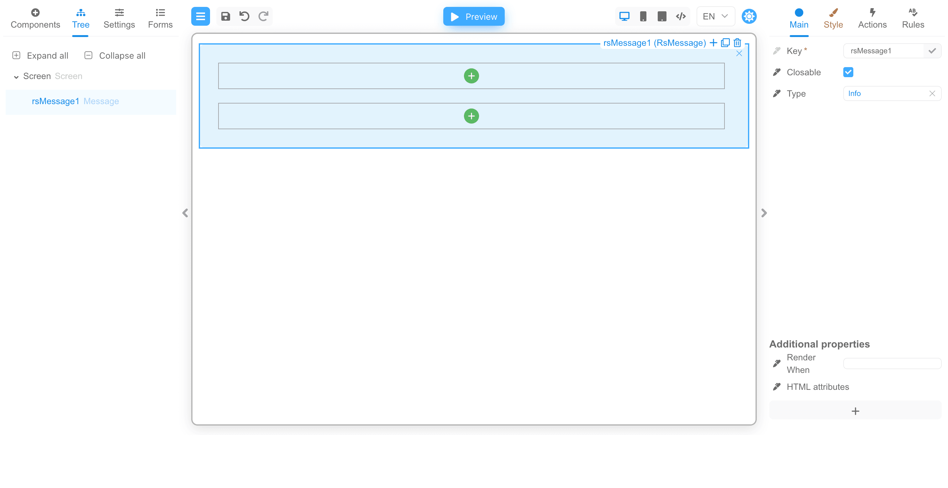
The following example showcases how to create a message component that contains multiple child components, including a header, a body, and a closable button.
Message Component with multiple children
In this example, we have a message component that allows users to specify the name of the
component and the type of message, such as info, success, warning, or error. This component incorporates multiple child components,
which can be any components of your choice. In this case, the children and header properties are properties that can contain a
collection of child components.
import styled from '@emotion/styled'
import {boolean, define, node, oneOf} from '@react-form-builder/core'
import {Message} from 'rsuite'

const SMessage = styled(Message)`
  .rs-message-header {
    overflow: initial;
  }
`

export const rsMessage = define(SMessage, 'RsMessage')
  .name('Message')
  .props({
    children: node,
    closable: boolean.default(false),
    header: node,
    type: oneOf('info', 'success', 'warning', 'error').default('info')
  })
The message component is called RsMessage and it incorporates the following properties:
children: this property represents the main content of the message. It can be any type of node, such as input, image, or any other component.closable: this property is a boolean that indicates whether the message is closable.header: this property allows you to provide a header for the message. It also accepts any node, allowing you to pass any component.type: this property specifies the type of message, which can be one ofinfo,success,warning, orerror. It defaults toinfo.
If you add a component to the form, you will see that there are green buttons for adding child components at the places where the children
and header properties should be displayed.
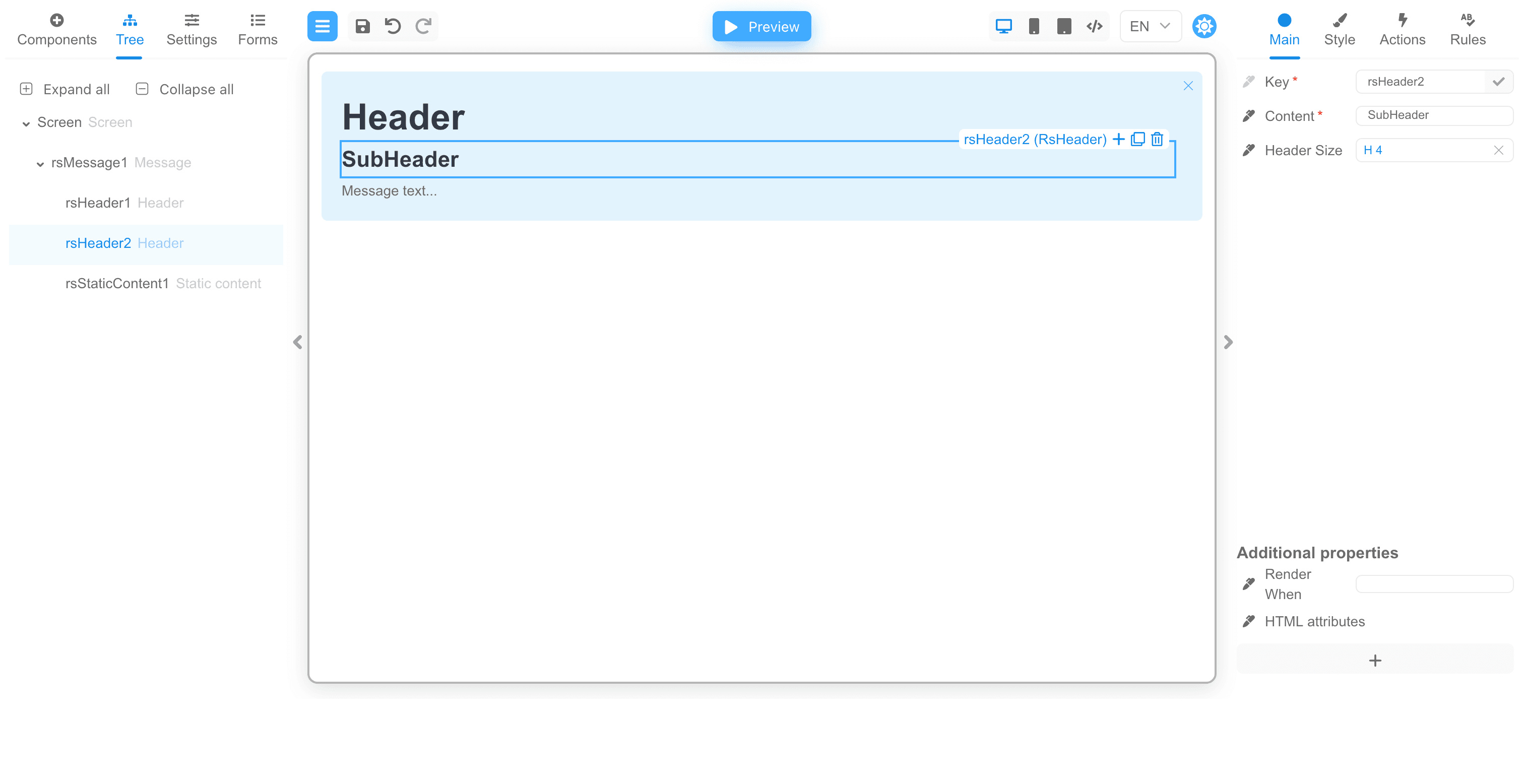
If you add a header and subheader, as well as the text of the message, you can see that the green buttons are no longer there, and the child components are already displayed:
By defining such components with multiple children, you can create a complex and reusable forms that can be easily customized and extended.