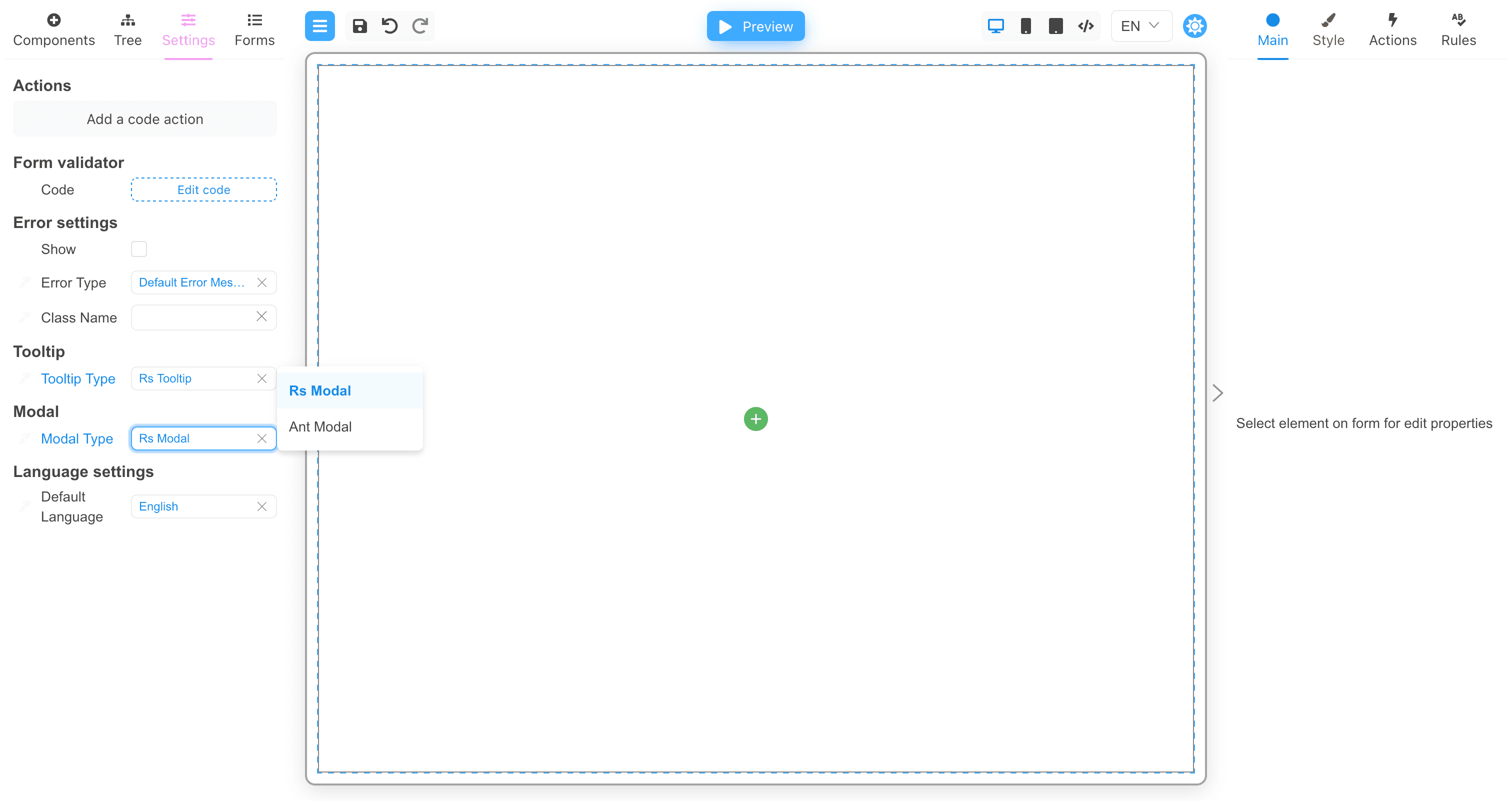
RsModal
Introduction
The RsModal component displays modal dialog box component for message prompts, acknowledgement messages, and submissions. This component is hidden in the Designer on the component palette and have to be specified in the form settings.

This component is a part of @react-form-builder/components-rsuite.
Main properties
The following general properties are available within the Main tab:
| Name | Type | Description |
|---|---|---|
| Auto focus | boolean | When set to true, the Modal is opened and is automatically focused on its own, accessible to screen readers |
| Backdrop | boolean | When set to true, the Modal will display the background when it is opened. Clicking on the background will close the Modal |
| Backdrop className | string | Add an optional extra class name to .modal-backdrop It could end up looking like class="modal-backdrop foo-modal-backdrop in" |
| CSS class prefix | string | The prefix of the component CSS class |
| CSS class for dialog | string | CSS class applied to Dialog DOM nodes |
| Enforce focus | boolean | When set to true, Modal will prevent the focus from leaving when opened, making it easier for the secondary screen reader to access |
| Close by Esc | boolean | Close Modal when Esc key is pressed |
| Overflow | boolean | Automatically sets the height when the body content is too long |
| Size | choise | Determine the width of the modal (i.e., Extra small, Small, Medium, Large, or Full) |